Hands-on: Tidy Data and Visualization

Author

Rony Rodriguez-Ramirez

Published

14 August 2024

Introduction

In this hands-on session, we will explore the relationship between various state-level characteristics and the share of votes received by Donald Trump in the 2016 presidential election. We will build a visualization step by step, using the ggplot2 package in R. Throughout this session, you’ll learn how to manipulate data, create plots, and progressively add layers to enhance your visualizations.

Note on the Data

The dataset we’ll be using contains various economic and demographic indicators for U.S. states during the 2016 presidential election. It includes information such as the percentage of the population that completed college (percoled), the share of votes received by Donald Trump (trumpshare), whether Trump won the state (trumpw), and more. Understanding the context of these variables will help you interpret the plots we create.

Overview of Functions to Be Used

We’ll use the following functions in our session:

  • ggplot(): Initializes a ggplot object that stores data and aesthetic mappings.
  • aes(): Defines aesthetic mappings such as x and y axes, color, size, etc.
  • geom_point(): Adds points to the plot, commonly used for scatter plots.
  • geom_smooth(): Adds a smoothed conditional mean, often used to visualize trends.
  • geom_hline(): Adds a horizontal line across the plot, useful for reference lines.
  • geom_text(): Adds text labels to points in the plot.
  • scale_x_continuous() and scale_y_continuous(): Adjust the scales of the axes.
  • scale_color_manual(): Manually adjusts the color scale used in the plot.
  • coord_cartesian(): Limits the plot display area without changing the data.
  • facet_wrap(): Creates separate plots (facets) for subsets of data.
  • labs(): Adds labels to the axes, title, and other plot elements.
  • theme_minimal(): Applies a minimal theme to the plot for a clean look.

Data Preparation

Load Packages

We’ll begin by loading the necessary packages that will help us manipulate the data and create visualizations.

# Load the necessary packages for data manipulation and visualization.
library(tidyverse)
── Attaching core tidyverse packages ──────────────────────── tidyverse 2.0.0 ──
βœ” dplyr     1.1.4     βœ” readr     2.1.5
βœ” forcats   1.0.0     βœ” stringr   1.5.1
βœ” ggplot2   3.5.1     βœ” tibble    3.2.1
βœ” lubridate 1.9.3     βœ” tidyr     1.3.1
βœ” purrr     1.0.2     
── Conflicts ────────────────────────────────────────── tidyverse_conflicts() ──
βœ– dplyr::filter() masks stats::filter()
βœ– dplyr::lag()    masks stats::lag()
β„Ή Use the conflicted package (<http://conflicted.r-lib.org/>) to force all conflicts to become errors
library(hrbrthemes)

Load the Data

Next, we’ll load the election dataset, which contains information about state-level turnout and various economic indicators during the 2016 presidential election.

# Load the election dataset.
election <- read_csv("https://www.dropbox.com/scl/fi/hv1cy5yrwrg2my97dtvly/election_turnout.csv?rlkey=4k44vg4781tv5zaac7cxkq8uf&dl=1")
Rows: 51 Columns: 15
── Column specification ────────────────────────────────────────────────────────
Delimiter: ","
chr  (3): state, region, division
dbl (12): rownames, year, turnoutho, perhsed, percoled, gdppercap, ss, trump...

β„Ή Use `spec()` to retrieve the full column specification for this data.
β„Ή Specify the column types or set `show_col_types = FALSE` to quiet this message.

Inspect the Data

It’s always important to inspect your data before starting any analysis. This helps you understand the structure of the data and the types of variables you’re working with.

# Use glimpse() to get a quick overview of the dataset.
election |> 
  glimpse()
Rows: 51
Columns: 15
$ rownames    <dbl> 1, 2, 3, 4, 5, 6, 7, 8, 9, 10, 11, 12, 13, 14, 15, 16, 17,…
$ year        <dbl> 2016, 2016, 2016, 2016, 2016, 2016, 2016, 2016, 2016, 2016…
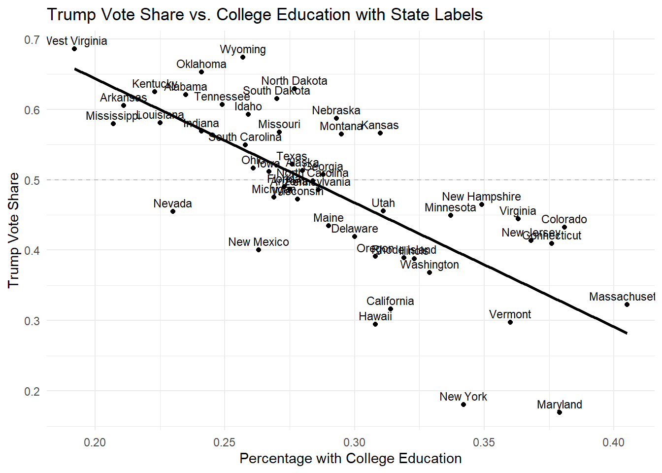
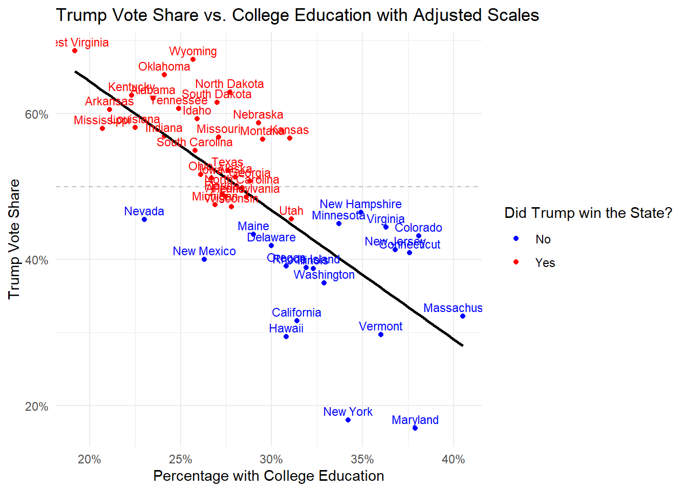
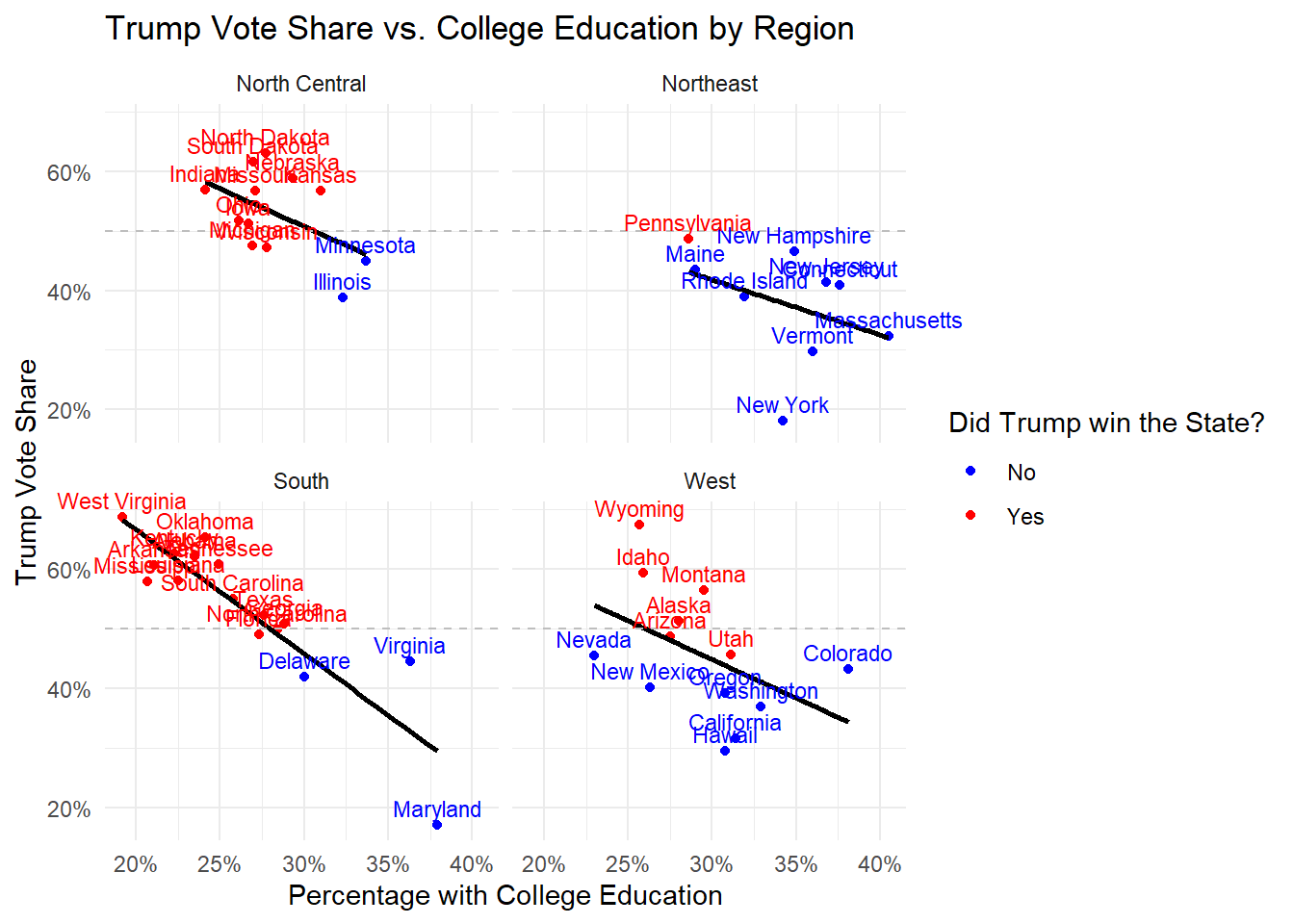
$ state       <chr> "Alabama", "Alaska", "Arizona", "Arkansas", "California", …
$ region      <chr> "South", "West", "West", "South", "West", "West", "Northea…
$ division    <chr> "East South Central", "Pacific", "Mountain", "West South C…
$ turnoutho   <dbl> 59.0, 61.3, 55.0, 52.8, 56.7, 70.1, 65.2, 64.4, 60.9, 64.6…
$ perhsed     <dbl> 84.3, 92.1, 86.0, 84.8, 81.8, 90.7, 89.9, 88.4, 89.3, 86.9…
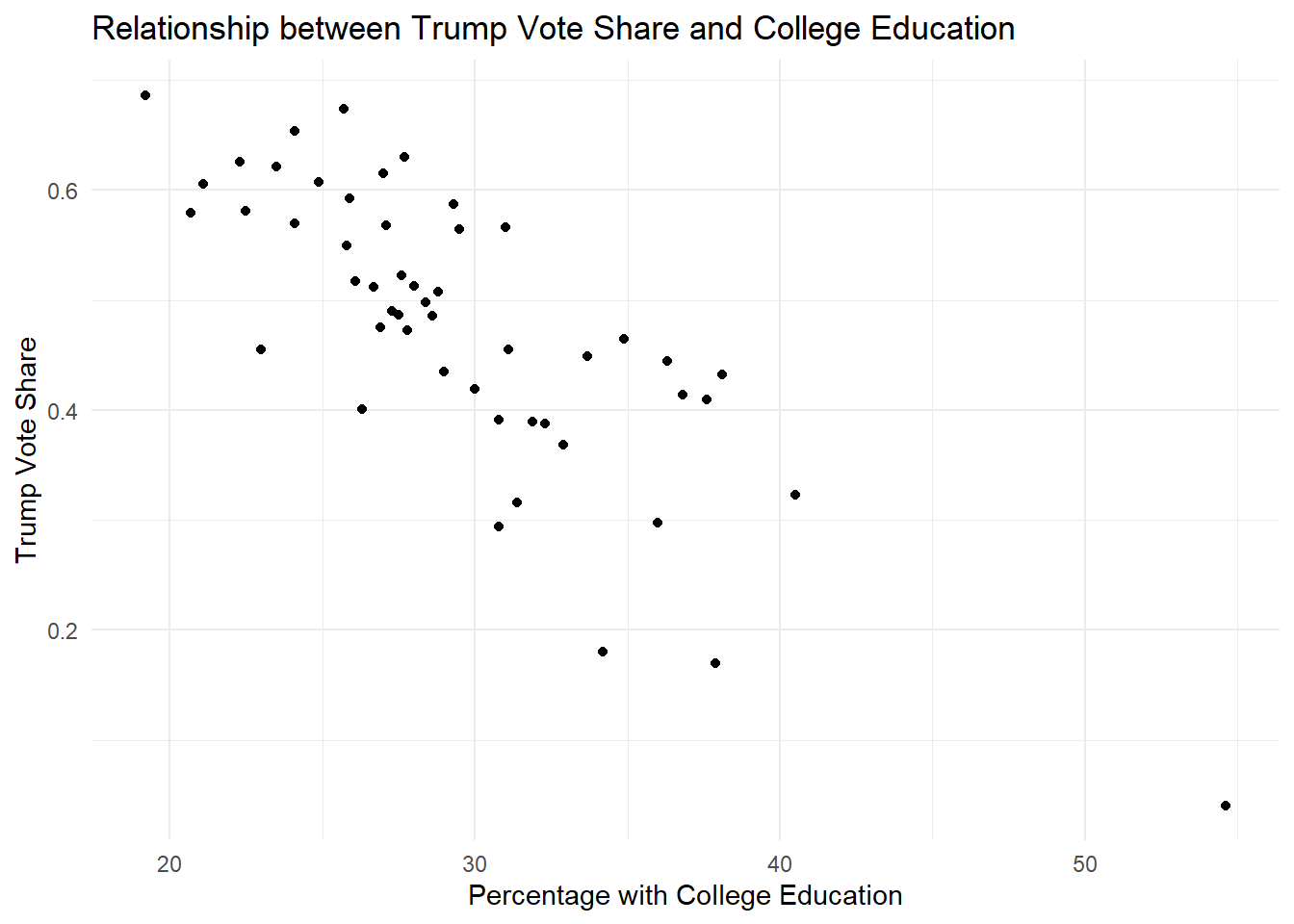
$ percoled    <dbl> 23.5, 28.0, 27.5, 21.1, 31.4, 38.1, 37.6, 30.0, 54.6, 27.3…
$ gdppercap   <dbl> 42663, 81801, 43269, 41129, 61924, 58009, 72331, 69930, 18…
$ ss          <dbl> 0, 0, 0, 0, 0, 1, 0, 0, 0, 1, 0, 0, 0, 0, 0, 1, 0, 0, 0, 0…
$ trumpw      <dbl> 1, 1, 1, 1, 0, 0, 0, 0, 0, 1, 1, 0, 1, 0, 1, 1, 1, 1, 1, 0…
$ trumpshare  <dbl> 0.62083092, 0.51281512, 0.48671616, 0.60574102, 0.31617107…
$ sunempr     <dbl> 5.8, 6.9, 5.2, 3.8, 5.4, 2.9, 4.9, 4.5, 6.0, 4.7, 5.3, 2.8…
$ sunempr12md <dbl> -0.2, 0.3, -0.6, -0.6, -0.3, -0.6, -0.7, -0.2, -0.5, -0.4,…
$ gdp         <dbl> 203829.8, 49363.4, 311091.0, 120374.8, 2657797.6, 329368.3…

Exercise 1: Basic Scatter Plot

Objective

In this exercise, we aim to create a basic scatter plot that visualizes the relationship between the share of the vote Trump received (trumpshare) and the percentage of the state that completed college (percoled). This is a straightforward way to explore potential correlations between education levels and voting behavior.

Instructions

Use the ggplot() function to initialize the plot, mapping percoled to the x-axis and trumpshare to the y-axis. Then, add points to the plot using geom_point().

# Create a basic scatter plot.
election |> 
  ggplot(
    aes(
      x = percoled,    # percoled on the x-axis
      y = trumpshare   # trumpshare on the y-axis
    )
  ) +
  geom_point() +          # Add points to represent each state
  labs(
    title = "Relationship between Trump Vote Share and College Education",
    x = "Percentage with College Education",
    y = "Trump Vote Share"
  ) +
  theme_minimal()

Explanation

In this plot, each point represents a state, with the x-axis showing the percentage of the population with a college education and the y-axis showing the percentage of votes Trump received. This basic plot will help us identify any apparent trends or outliers.

Exercise 2: Data Transformation

Objective

Before enhancing our plot, we’ll transform some variables to better suit our analysis. Specifically, we’ll convert trumpw into a categorical variable (factor) and rescale percoled to represent it as a proportion (dividing by 100).

Instructions

Use the mutate() function to transform the data and then create a scatter plot with the transformed variables.

# Transform the data.
election_transformed <- election |> 
  mutate(
    trumpw = as_factor(trumpw),  # Convert trumpw to a factor
    percoled = percoled / 100    # Rescale percoled to be a proportion
  )

# Plot using the transformed data.
election_transformed |> 
  ggplot(
    aes(
      x = percoled,
      y = trumpshare
    )
  ) +
  geom_point() +
  labs(
    title = "Trump Vote Share vs. College Education (Transformed Data)",
    x = "Percentage with College Education",
    y = "Trump Vote Share"
  ) +
  theme_minimal()

Explanation

By converting trumpw to a factor, we make it easier to group the data by whether Trump won a state. Rescaling percoled to a proportion standardizes the variable, allowing for more intuitive interpretation, especially when we apply formatting later on.

Exercise 3: Filtering Data

Objective

In this exercise, we’ll filter out the District of Columbia from our dataset. D.C. is often an outlier in many analyses due to its unique characteristics, so excluding it can make patterns in the rest of the data clearer.

Instructions

Use the filter() function to remove D.C. from the dataset, then create a scatter plot with the filtered data.

# Filter the data.
election_filtered <- election_transformed |> 
  filter(state != "District of Columbia")

# Plot the filtered data.
election_filtered |> 
  ggplot(
    aes(
      x = percoled,
      y = trumpshare
    )
  ) +
  geom_point() +
  labs(
    title = "Trump Vote Share vs. College Education (Filtered Data)",
    x = "Percentage with College Education",
    y = "Trump Vote Share"
  ) +
  theme_minimal()

Explanation

Removing D.C. reduces the potential for this outlier to skew the visual representation of the data, allowing for a more accurate depiction of the relationship between education levels and Trump’s vote share in the other states.

Exercise 4: Adding a Regression Line

Objective

To better understand the relationship between education and Trump’s vote share, we’ll add a linear regression line to our scatter plot. This line will help us see the overall trend in the data.

Instructions

Use geom_smooth() with the method = "lm" argument to add a linear regression line to your scatter plot.

# Add a linear regression line to the plot.
election_filtered |> 
  ggplot(
    aes(
     

 x = percoled,
      y = trumpshare
    )
  ) +
  geom_point() +
  geom_smooth(method = "lm", color = "black", se = FALSE) +       # Add a linear regression line
  labs(
    title = "Trump Vote Share vs. College Education with Regression Line",
    x = "Percentage with College Education",
    y = "Trump Vote Share"
  ) +
  theme_minimal()
`geom_smooth()` using formula = 'y ~ x'

Explanation

The regression line provides a clear visual summary of the direction and strength of the relationship between the percentage of college-educated individuals and Trump’s vote share. The slope of the line will indicate whether there’s a positive or negative correlation.

Exercise 5: Adding a Horizontal Reference Line

Objective

In this exercise, we’ll add a horizontal reference line at 50% Trump vote share. This line represents a key threshold, indicating whether Trump received more or less than half of the votes in each state.

Instructions

Use geom_hline() to add a horizontal dashed line at y = 0.5.

# Add a horizontal reference line at 50% Trump vote share.
election_filtered |> 
  ggplot(
    aes(
      x = percoled,
      y = trumpshare
    )
  ) +
  geom_point() +
  geom_smooth(method = "lm", color = "black", se = FALSE) +
  geom_hline(yintercept = 0.5, linetype = "dashed", color = "grey") + # Add horizontal line at 50%
  labs(
    title = "Trump Vote Share vs. College Education with Reference Line",
    x = "Percentage with College Education",
    y = "Trump Vote Share"
  ) +
  theme_minimal()
`geom_smooth()` using formula = 'y ~ x'

Explanation

The 50% line is a critical point of reference, as it allows us to quickly see which states Trump won (above the line) and which he lost (below the line). This adds another layer of interpretation to the plot.

Exercise 6: Adding Text Labels

Objective

To make the plot more informative, we’ll add text labels to the points. This will allow us to see which state each point represents without having to hover over or refer to another source.

Instructions

Use geom_text() to add state labels to the points on your scatter plot.

# Add text labels to the points.
election_filtered |> 
  ggplot(
    aes(
      x = percoled,
      y = trumpshare
    )
  ) +
  geom_point() +
  geom_smooth(method = "lm", color = "black", se = FALSE) +
  geom_hline(yintercept = 0.5, linetype = "dashed", color = "grey") +
  geom_text(aes(label = state), vjust = -0.5, size = 3, show.legend = FALSE) + # Add text labels
  labs(
    title = "Trump Vote Share vs. College Education with State Labels",
    x = "Percentage with College Education",
    y = "Trump Vote Share"
  ) +
  theme_minimal()
`geom_smooth()` using formula = 'y ~ x'

Explanation

By labeling each point with its corresponding state abbreviation, we can easily identify which states exhibit particular voting and education patterns. This is especially useful for recognizing outliers or regional trends.

Exercise 7: Adjusting Axis Scales

Objective

To improve the readability of our plot, we’ll adjust the x and y axes to display percentages. We’ll also add a custom color scale to differentiate between states that Trump won and those he didn’t.

Instructions

Use scale_x_continuous() and scale_y_continuous() to format the axes as percentages, and scale_color_manual() to define custom colors for the trumpw variable.

# Adjust axis scales and color scale.
election_filtered |> 
  ggplot(
    aes(
      x = percoled,
      y = trumpshare,
      color = trumpw    # Color points by whether Trump won the state
    )
  ) +
  geom_point() +
  geom_smooth(method = "lm", color = "black", se = FALSE) +
  geom_hline(yintercept = 0.5, linetype = "dashed", color = "grey") +
  geom_text(aes(label = state), vjust = -0.5, size = 3, show.legend = FALSE) +
  scale_x_continuous(labels = scales::percent) +  # Format x-axis as percentage
  scale_y_continuous(breaks = seq(0,1,.2), labels = scales::percent) +  # Format y-axis as percentage
  scale_color_manual(labels = c("No", "Yes"), values = c("blue", "red")) + # Custom color scale
  labs(
    title = "Trump Vote Share vs. College Education with Adjusted Scales",
    x = "Percentage with College Education",
    y = "Trump Vote Share",
    color = "Did Trump win the State?"
  ) +
  theme_minimal()
`geom_smooth()` using formula = 'y ~ x'

Explanation

Formatting the axes as percentages makes the data more interpretable for viewers. The custom color scale enhances the plot by visually distinguishing states based on the election outcome, making patterns and trends easier to detect.

Exercise 8: Adding Facets

Objective

Finally, we’ll use facets to create separate plots for each region. This allows us to compare trends across different parts of the country more effectively.

Instructions

Use facet_wrap(~ region) to create a separate plot for each region.

# Add facets to create separate plots by region.
election_filtered |> 
  ggplot(
    aes(
      x = percoled,
      y = trumpshare,
      color = trumpw
    )
  ) +
  geom_point() +
  geom_smooth(method = "lm", color = "black", se = FALSE) +
  geom_hline(yintercept = 0.5, linetype = "dashed", color = "grey") +
  geom_text(aes(label = state), vjust = -0.5, size = 3, show.legend = FALSE) +
  scale_x_continuous(labels = scales::percent) +  
  scale_y_continuous(breaks = seq(0,1,.2), labels = scales::percent) +
  scale_color_manual(labels = c("No", "Yes"), values = c("blue", "red")) +
  coord_cartesian(clip = "off") + # Ensure labels are not clipped
  facet_wrap(~ region) +          # Facet by region
  labs(
    title = "Trump Vote Share vs. College Education by Region",
    x = "Percentage with College Education",
    y = "Trump Vote Share",
    color = "Did Trump win the State?"
  ) +
  theme_minimal()
`geom_smooth()` using formula = 'y ~ x'

Explanation

Faceting allows us to see how the relationship between education and Trump’s vote share varies across different regions. This can reveal regional differences that might not be apparent when looking at the data as a whole.

Recap

In this session, we’ve progressively built a complex ggplot2 visualization, starting from a basic scatter plot and adding layers such as regression lines, reference lines, text labels, custom scales, and facets. Each step has added more depth to our understanding of the data, demonstrating the power and flexibility of ggplot2 for exploring relationships within data.